Minimalist Phone: Make Your Android Less Addictive
The minimalist phone movement has one core idea: if your phone is boring, you’ll use it less. Strip away the color. Hide the apps. Replace your home screen with a text list. Remove every visual hook that makes your thumb reach for the screen. The underlying philosophy is digital minimalism — choose technology on purpose, not by default.
It’s a good idea. It works for some people. And for most people, it stops working after about two weeks.
Here’s every approach to making your Android phone less addictive, what each one actually does to your usage, and where each one breaks down.
Minimalist launchers
Apps like Minimalist Phone, Olauncher, and Before Launcher replace your home screen with a stripped-down text list. No app icons. No widgets. No wallpaper. Just a list of app names in plain text. Some go further and limit which apps appear, hiding social media from the launcher entirely.
The effect is real at first. Your home screen stops beckoning. The dopamine triggers from colorful icons and notification badges disappear. You use your phone with more intention because every app requires typing or scrolling through a list instead of tapping a bright icon.
The problem is that minimalist launchers make the access boring without changing the content. TikTok is still one search away. Instagram still works the same once you open it. The launcher is a speed bump at the front door. Once you’re inside, the infinite scroll is just as infinite as it was before.
After a week or two, you’ve memorized the text list. Your thumb goes to the same spot. “Instagram” in plain text becomes just as automatic to tap as the Instagram icon was. The novelty of the blank screen wears off, and the habits reassert themselves because the underlying reward mechanism hasn’t changed.
Minimalist Phone (the app, with 27K monthly searches) has an interesting feature where it can block specific apps entirely from appearing, not just hide them. That gets closer to actual restriction. But then you’re back to the blocker problem: you control the settings, so you can un-hide the app anytime you want.
Minimalist launchers also make your phone worse for everything. Not just the distracting apps. Finding your banking app, opening your calendar, launching Maps — all of it gets slower when your launcher is designed to create friction. You’re punishing yourself equally for checking your bank balance and doom-scrolling TikTok.
Grayscale mode
Turn off the color. Your phone becomes a 1950s newspaper. TikTok thumbnails are gray blobs. Instagram loses its visual appeal. The theory: without color, the content is less stimulating, so you scroll less.
Android lets you enable grayscale through Developer Options or Digital Wellbeing’s Bedtime Mode. Some minimalist launchers include a grayscale toggle. It’s free and takes 30 seconds to set up.
It works for about a week. Maybe two if you’re committed. Then your brain adjusts. Gray becomes normal. You still watch the dog video. The dog is still funny in grayscale. The dopamine response doesn’t depend on color. It depends on novelty, and the content is still novel. A dopamine detox hits the same wall for the same reason.
The bigger issue: grayscale makes photos look dead, maps nearly unusable, and work apps harder to parse. You end up toggling it off for “just a minute” to check something, and forget to turn it back on. Within a month, it’s a setting you enabled once and abandoned.
Notification management
Disable notifications for every non-essential app. No Instagram alerts. No TikTok “someone you follow posted.” No YouTube recommendations. Keep calls, messages, and calendar. Kill everything else.
This is one of the more effective approaches because it removes the trigger that starts most scrolling sessions. You don’t decide to open TikTok. A notification pulls you in, and 40 minutes later you’re still there. Remove the notification, remove the trigger.
Where it falls short: it only blocks one entry point. You still pick up your phone out of boredom, habit, or restlessness. The notification didn’t cause the boredom. The boredom was already there. Without the notification trigger, you still reach for the phone, still open the app, still scroll. You just do it on your own schedule instead of the app’s schedule. For some people, that’s enough of a change. For others, the habit is deeper than the trigger.
App timers and blockers
Android’s Digital Wellbeing includes app timers. Third-party apps like AppBlock and Freedom add stricter blocking with schedules, PIN locks, and cross-device sync.
These are the most direct approach. Can’t open the app? Can’t scroll. Problem solved.
Except only 12% of people actively use built-in screen time limits. The rest set them and override them. AppBlock’s strict mode makes cheating harder, but you have to opt into strict mode during a moment of motivation, and you have to keep opting in. One weak evening and the block is off.
Blockers also don’t address the phone as a whole. Block TikTok and you scroll Instagram. Block Instagram and you scroll Reddit. Block Reddit and you scroll YouTube Shorts. The addiction isn’t to a specific app. It’s to the scroll itself. Blocking individual apps is whack-a-mole. The shape of phone addiction is the device, not the app.
Friction apps
One Sec adds a breathing exercise before opening distracting apps. ScreenZen adds a countdown and a mindful prompt. Both interrupt the autopilot that starts a scrolling session.
These work better than pure blockers for most people because they don’t create something to rebel against. You can still open the app. You just have to pause first. That pause is enough to break the loop some of the time.
The fade is the issue. After a few weeks, the breathing exercise becomes a loading animation. You breathe through it on autopilot without actually reconsidering. ScreenZen’s “is this important?” prompt becomes a button you tap without reading. Friction loses its friction when it becomes routine.
The approach that doesn’t try to be boring
Every method above makes your phone boring, restricted, or slow. They all assume that if the phone is less appealing, you’ll use it less.
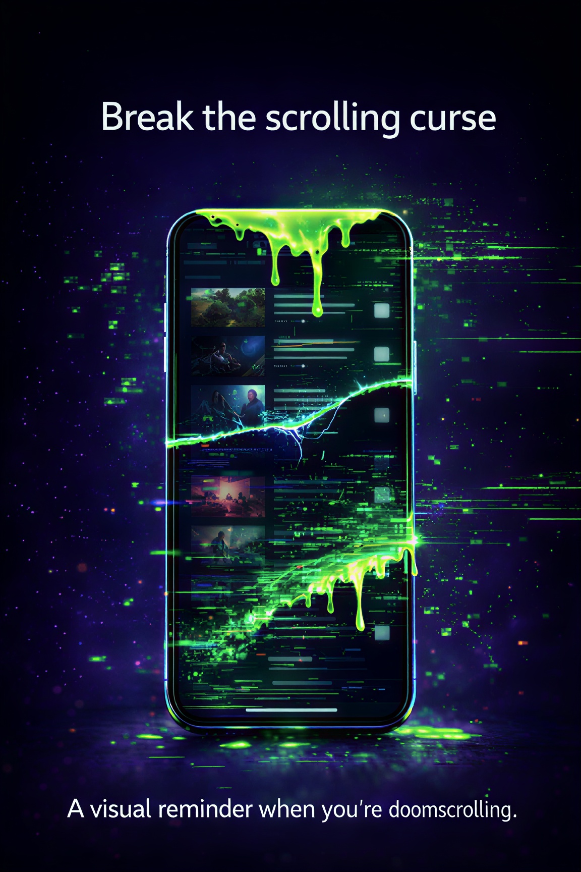
Cursed Screen does the opposite. It makes your phone actively unpleasant.
After a configurable grace period, visual overlays start creeping in from the edges. Flames. Crawling insects. Glass fracturing across the screen. The longer you use your phone, the worse it looks. Nothing is blocked. Nothing is hidden. The phone still works perfectly. It just looks like it’s falling apart.
The difference from every minimalist approach: you don’t adapt to it the way you adapt to grayscale or a text launcher. Your brain normalizes gray after two weeks. It doesn’t normalize bugs crawling across your feed. The visual overlays change, intensify, and hit a different part of your response system than “this looks boring.” They hit the part that says “this looks wrong.”
It also doesn’t make the useful parts of your phone worse. Maps work fine. Banking works fine. Messaging works fine. The overlay is tied to cumulative screen time, not specific apps. Use your phone for 5 minutes to check directions and there’s no overlay at all. Use it for 2 hours of TikTok and the screen is on fire. The punishment scales with the behavior, not with the phone.
For the minimalist phone crowd specifically: you can combine Cursed Screen with a minimalist launcher. The launcher reduces the visual triggers on your home screen. Cursed Screen handles what happens when you open an app anyway and stay too long. Belt and suspenders.
There’s a positive mode too. Flashes of aurora and sunlight with messages like “there’s magic out there.” For people who want the minimalist phone ethos but prefer encouragement over punishment.
Which approach to start with
If you’ve never tried any of this, start with notification management. It’s free, takes 5 minutes, and has the highest effort-to-impact ratio. Disable non-essential notifications and see if your pickups decrease.
If you’ve already tried that, try a minimalist launcher for a week. Olauncher is free and open-source. See if the reduced visual stimulation changes your patterns.
If you’ve tried both and the scroll still wins, Cursed Screen has a free trial on Android. Subscribe monthly or annually, or pay once for lifetime access. It stops trying to make your phone boring and starts making it ugly. Different mechanism, different result.
The minimalist phone movement is onto something. The phone should feel different. The question is whether “boring” is enough, or whether you need “wrong.”
Most people who search for “minimalist phone” have already tried the easy stuff. They’ve deleted apps, turned off notifications, maybe tried a digital detox that lasted a weekend. The minimalist launcher is the next logical step. But if the scroll still wins after you’ve stripped your phone down to a text list, the problem runs deeper than what your home screen looks like. At that point, you need something that changes the scroll itself, not just the gateway to it.
Reduce your screen time — without blocking anything
Cursed Screen makes your phone progressively uglier the longer you use it. No blocking, no willpower needed — you'll want to put it down.
Get Cursed Screen on Google Play